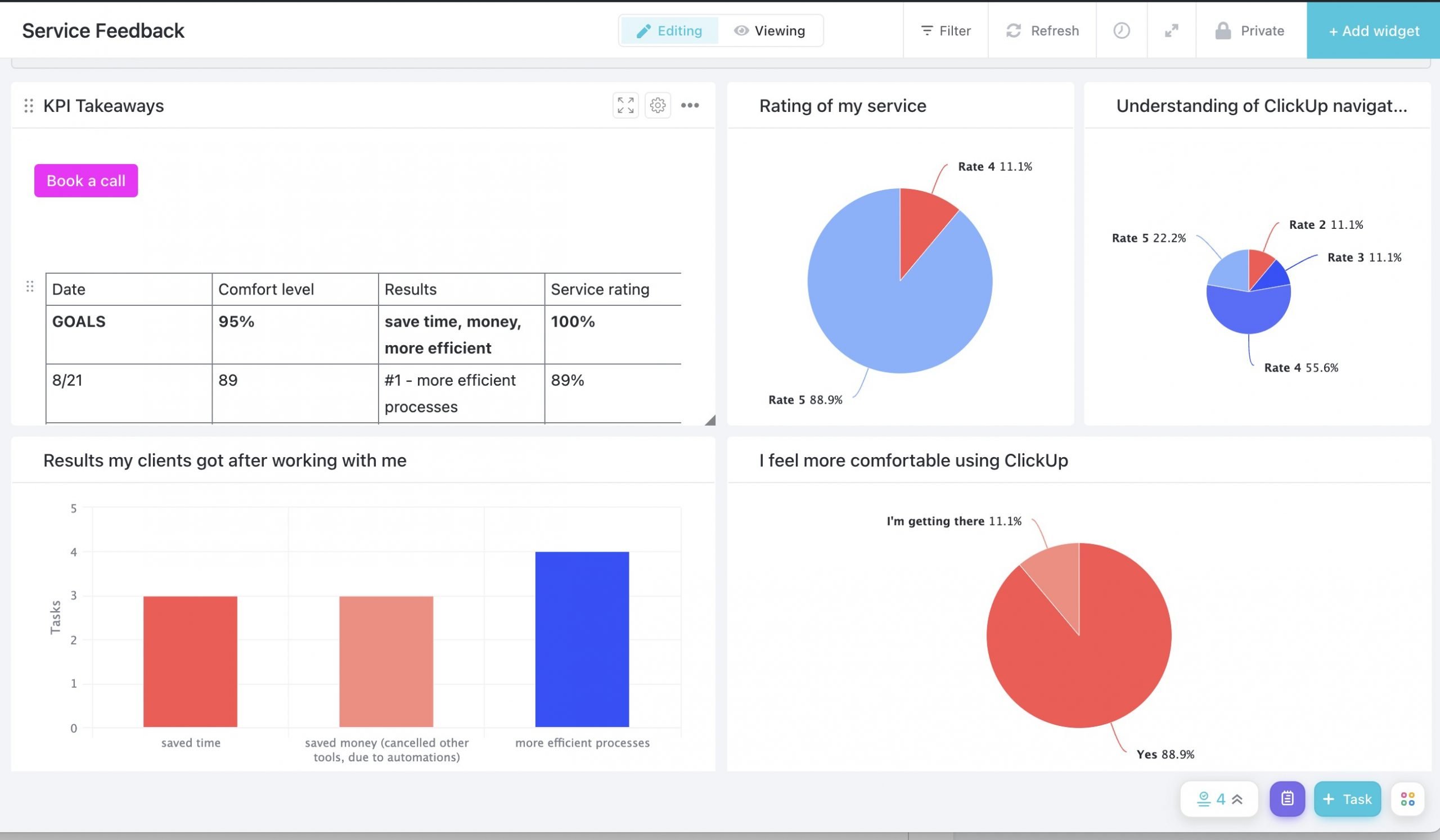
ClickUp dashboards can aid in organization and communication, provide a high-level overview of all your projects, make onboarding a smooth process for new team members, have beautiful design, and give the CEO the data she needs to make data-driven decisions for her business. This article will focus on how to use dashboards for making data-driven decisions.
The first step in creating a data-driven dashboard in ClickUp is reviewing your business’s strategic plan. What are your goals and plans for the next few quarters and what data do you need to collect to make evaluate whether or not you have achieved those goals?
For this article, we will look at a Lead Tracking/CRM Dashboard which makes it easy for me to evaluate my leads and my services.
Getting Started
Before setting up a ClickUp dashboard, you need to have the data in ClickUp. But even before that, you should determine whether or not you should be tracking this data in ClickUp, or if it’s better to track in Google Data Studio, a Google sheet, or another tool.
Just because you can track data in ClickUp, doesn’t mean you should. For example, data from Google Analytics may be best tracked elsewhere, like in a Google Sheet pulling automatically from Google Analytics.
Alternatively, you could manually input the data from Google Analytics into ClickUp or use a tool like Zapier, but I recommend using ClickUp dashboards for what they’re really good at and letting other tools do what they’re really good at.
Preparing Your Hierarchy and Custom Fields
Ensure that you have a simple hierarchy with the necessary custom fields for the data you need to be tracking. If you are trying to determine your best source of leads so that you can go all in on marketing there, make sure that you have a dropdown custom field in your leads list where you indicate the lead source.
Then, you can pull this data into a lead tracking dashboard which shows you the breakdown of lead sources.
Sources Of All Leads
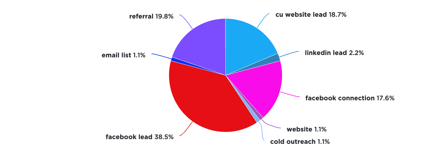
This shows me that most of my leads arise from Facebook groups and Facebook connections. From this data I can surmise that focusing on Facebook marketing would be a good use of my time. But it is also important I note where my won leads are coming from.
Sources Of All Won Leads

By comparing this with the chart that shows the source of the won leads above, it is evident here that though more than half of my leads come from Facebook, my won leads are mostly from the verified ClickUp Consultant directory, referrals, and Facebook connections. This data helps me decide where I should invest in marketing and can be used to determine whether specific marketing and sales goals are met.
Services That All Leads Are Interested In

Now this widget shows me the services that all leads are interested in. The next widget, however, shows the services that the leads actually buy. This is once again helpful in pointing out where I need to focus my efforts and which services I should be marketing more and those I can consider discontinuing.
Won Leads By Industry
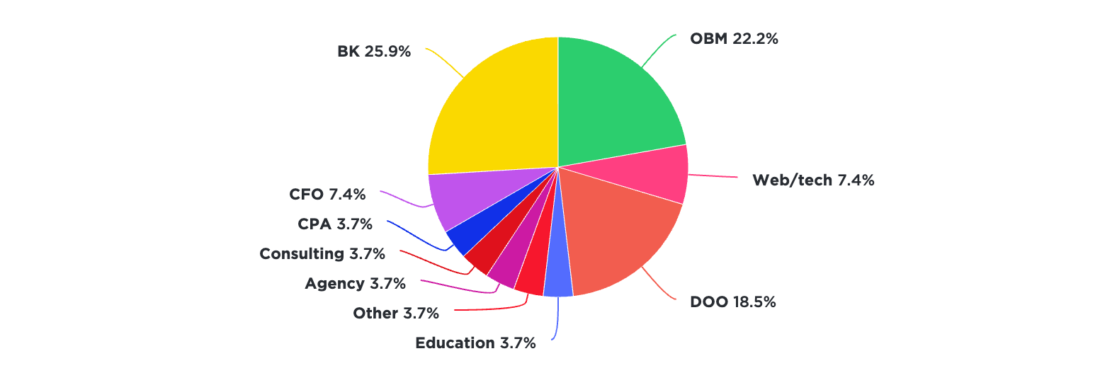
This shows what industries the leads are from. This provides me with important information because I can zero in on which industries I should focus my marketing efforts on.
Services Bought By Won Leads


The first chart analyzes the different services that I sold overall and the second specifies those that I sold last month.
The first step in creating a data-driven dashboard in ClickUp is reviewing your business’s strategic plan.
Customize Your Widgets
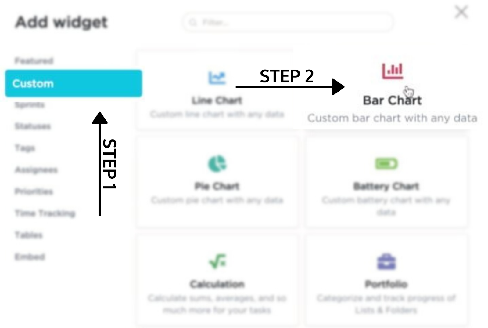
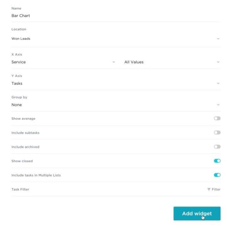
You can create a completely customized ClickUp dashboard using the various widgets in a matter of minutes. For example, if you want to make a bar chart, click on ‘+Add widget’ and then ‘Custom’. Select ‘Bar Chart’. Select the location of your hierarchy you want to display in the chart such as “Client Management”. Customize your X and Y axis and your chart is ready to go.
Learn to Build My Exact Dashboards
In my Create Data-Driven ClickUp Dashboards I should you exactly how to build this dashboard and more in only 10 minutes.
