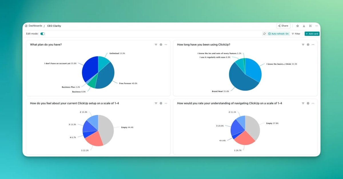
This post may contain affiliate links and I may earn a small commission when you click on the links at no additional cost to you.
Efficiency is the key to success for busy business owners like you. Managing multiple projects, tasks, and teams can be overwhelming, but there’s a solution that can revolutionize your work management: ClickUp dashboards, a powerful feature designed to streamline your workflows and boost productivity.
In this ultimate guide, we’ll explore everything you need to know about ClickUp dashboards and how they can transform the way you work. From creating your first dashboard to utilizing advanced features, we’ll take you through the steps to create a dashboard to help you take control of your business and work like a pro.
Understand ClickUp Dashboards
ClickUp dashboards are customizable workspaces within the ClickUp platform that allow you to organize and view your tasks, projects, and team activities in one place. They serve as a central hub for efficient project and task management, providing a bird’s-eye view of your business activities. With ClickUp dashboards, you can easily track progress, collaborate with your team, and stay on top of deadlines. By harnessing the power of dashboards, you can improve productivity, streamline communication, and ensure nothing falls through the cracks.

Creating Your First ClickUp Dashboard
To create your first ClickUp dashboard, follow these simple steps:
1. Open ClickUp and head to the Dashboards section.
2. Click on “New Dashboard” to start building your customized dashboard. Or use one the ClickUp templates to get you started.
3. Customize your dashboard by adding cards such as Task Lists, Calendars, and Charts.
4. Tailor the cards’ settings to display the information that matters most to you.
5. Experiment with different cards and configurations until you find the perfect setup.
Card Options and Functionality
ClickUp offers a wide range of cards (widgets) to enhance your dashboards. Each card serves a specific purpose and provides unique functionality. Here are my favorite widget cards and how they can benefit your workflow:
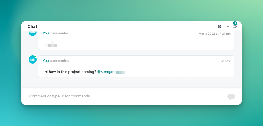
Chat Card:
Add the ability to chat to any of your dashboards. I use this with all of my clients. Pro tip: make sure you adjust your notifications so that you get notified how you wish when someone @ mentions you – and be sure to train your team to use @ when mentioning you.
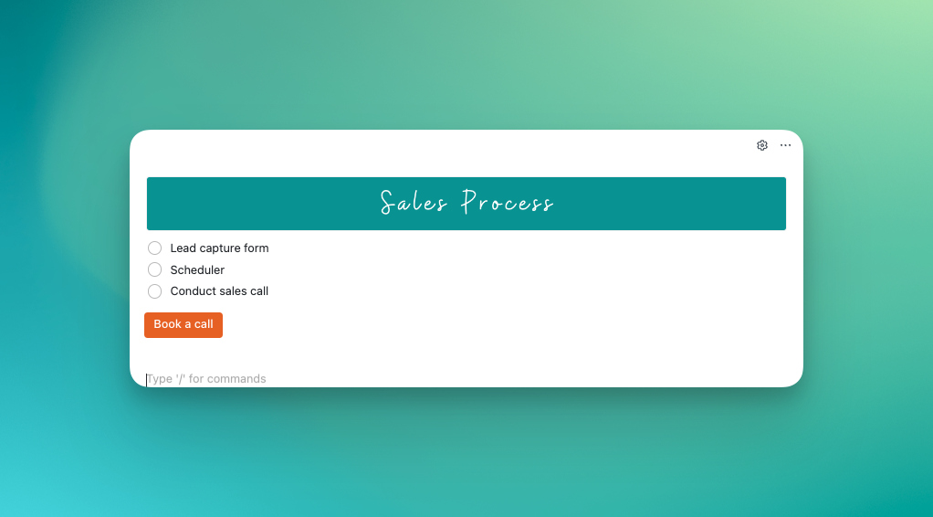
Text block:
Use a text block to add extra context to your dashboard. Use rich text, slash commands, and drop in images to give your dashboards some color. You can even the command /button to add a button into your text block.
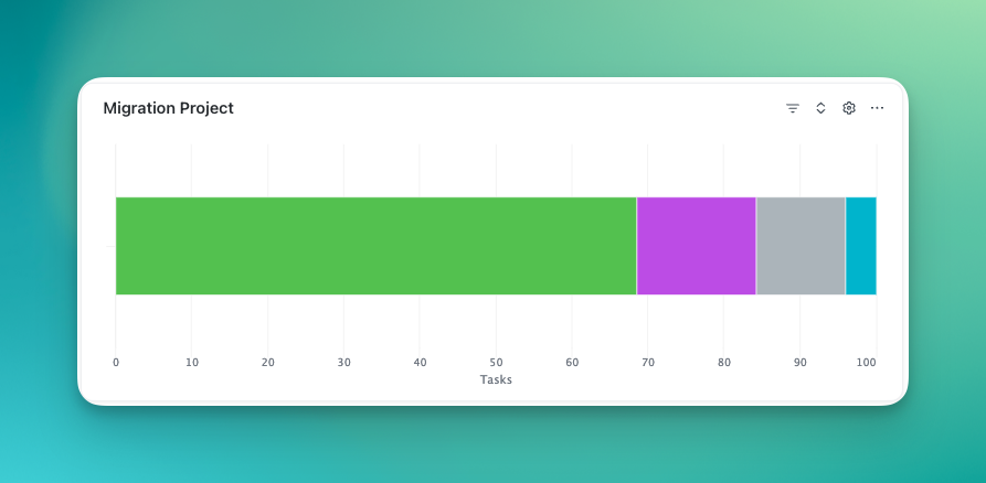
Workload by status pie chart or battery chart:
Need a high level view of the progress of a project? Use the workload by status pie chart or battery chart. Set the location as your project list and see how much progress you’ve made. As you can see in my example, this project is about 2/3 of the way done.
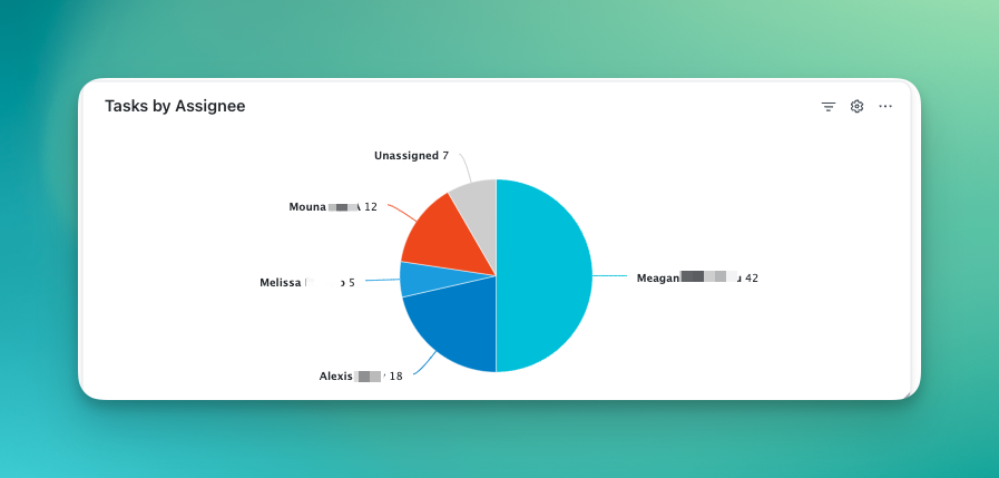
Tasks by assignee pie chart:
Take a look at the breakdown of assignees on a project (or across your workspace) to ensure that work is distributed properly.
Workspace Points:
Use the Workspace Points card in your dashboard to get an overview of your team’s efficiency in ClickUp. See who is communicating efficiently by adding and resolving comments, how many tasks are completed or worked on, and the total number of points per team team. Add filters for an even more drilled down view. Set a workspace points goal per week and crown the winner your ClickUp Queen or King!

Organizing Your Dashboard
To optimize your workflow, it’s essential to structure your dashboard effectively. The first step here is to make sure you have your lists, folders, and spaces organized efficiently with the appropriate custom fields filled in.
Here are some best practices for organizing your ClickUp dashboard:
1. Group related cards together to create logical sections.
2. Prioritize important information by placing key cards at the top or in a prominent position.
3. Customize cards sizes and layouts to create a visually appealing and easy-to-navigate dashboard.
Case Studies and Success Stories
Let’s take a look at some real-life examples of how businesses and individuals have benefited from ClickUp dashboards. Designs by KH, an award-winning interior designer, struggled with a scattered view of their sales pipeline until they implemented ClickUp dashboards. The visual clarity and data analysis helped them streamline their services. Similarly, The Writique, an award-winning resume writing business, used ClickUp dashboards to organize client tasks and get an overview of the team’s work. This saved them valuable time and allowed for more focused client interactions.
Tips for Dashboard Optimization
To ensure your dashboard remains efficient and effective in the long run, consider these tips:
1. Regularly review and update your dashboard to reflect your evolving business needs.
2. Seek feedback from your team members and incorporate their suggestions for improvement.
3. Experiment with different card configurations and layouts to find what works best for you.
4. Take advantage of ClickUp’s resources to maximize your dashboard’s potential.
ClickUp dashboards are the ultimate solution for streamlining your work like a pro. By creating customized workspaces, organizing cards, and utilizing advanced features, you can take control of your business activities and boost productivity. With mobile accessibility, collaboration becomes effortless. Create your own optimized ClickUp dashboards today and experience the transformative power it can bring to your business.
